Thursday, April 18, 2024

Hope you're feeling better!

One of the things that I love about card-making is that one can tailor a card to be so uniquely personal for someone's specific circumstances, interests and personality.  Today's card is an example of exactly that.

My neighbor, a physician, had his very own overnight hospital stay not long ago, and it was on his wife's birthday.  I wanted to make them each a card.  Here's his.


I've seen those cute shirt & tie cards, but I wanted this one to be two-layered with the lab coat over the shirt and omitting the tie.   To make it I cut the card base to be the traditional 5.5 inches tall, but 7.5 rather than 8.5 inches long , scored so that the card front is 3.25 rather than 4.25 wide (the back remains 4.25 wide).  Part of the front was trimmed off at an angle and a second piece of card stock adhered to the inside and folded around the front edge to create the lapel.  

The second sheet of white card stock measured approximately 7 x 3.5 inches, portrait orientation.  I folded back the lapel at a pleasing angle, cutting a small notch and then scoring from the point of the notch to the fold to give the illusion of the seam between lapel and collar (peek at a photo of a lab coat for inspiration and guidance).  That piece was then adhered to the inside of the card front and the top trimmed flush to the standard 5.5 inches to match the original card base.


I've also recently seen "pocket boutonnieres" made with a plastic ID card or baseball card sleeve with flower stems sandwiched inside, so that gave me the idea of the rose in the pocket along with an "embossed" pencil.  The rose is from one of our many lovely floral stamp sets (pick your favorite flower), and the sentiments inside and out are from our Typewritten "Just Checking In" set.  


Here's the shirt inside.  The lab coat and shirt pockets were both cut with rectangle dies, so the rest of the card  only required a little more cutting and scoring to make a collar and button placket.  I love the way it turned out...it has the perfect combination of words, and a warm, relaxed "country gentleman" vibe that is just the feel I was going for.

While this card was made for my neighbor's "doctor turned patient" circumstance, it would be easy to adapt for a prom or wedding groom/best man setting with a change of colors and prints and greetings.     

The plaid is an ode to my trip to Scotland!  I'm leaving tomorrow afternoon, carpooling with some girlfriends to Orlando to meet up with my son who, I am very excited to say, is going along, as are several others' husbands and brothers!  We have a direct flight from Orlando to Edinburgh and will be touring the country for nearly two weeks.  My husband will be keeping the home fires burning until our return.    

Supplies:

Thursday, April 11, 2024

Make Mine a Tall One!


In a little more than a week I'll be heading to Scotland on a trip with the "Yarnie Ewes," patrons of the central Florida yarn shop Olive & Two Ewes.  Scotland can be chilly and damp in April, so I have been knitting a few warm things to take on the trip!  One is a sweater which...after knitting almost half of it, I realized it was turning out too big...so I frogged it and started over.  Now I'm knitting "overtime" to try to finish it in time for the trip, and so lately knitting has frequently accompanied my morning coffee and has taken up a large portion of my days.  Since this paper looks like knit stitches to me (and I saw this clip on Pinterest), the idea for this card was born!


This is a really easy construction that looks more complicated than it actually is.  The circles cut from the front are used to make the flap, sandwiching the banner between the two layers.  (I did re-cut the circle of designer paper to a smaller size for layering so the mat would show underneath, but you wouldn't have to do that unless you want to).  

The end of the striped designer paper is a bit longer than the banner, and is glued onto the back of the card leaving just a little space between to accommodate the bulk of the fold when the card is closed and the fishtail banner is threaded through the opening (you'll see this in one of the photos below, so if it isn't making sense yet, hopefully it will before long!)


I love combining prints, and while shuffling through Craft Consortium paper pads, I discovered how beautifully these two designer prints from two different pads work together.  These colors are so scrumptious!  Our leafy sprigs mimic the shape of the leaves in the Bloom & Wild paper so I die cut some from white paper and colored them with various Copic markers, adding a little texture with some daubs of distress oxide inks.  There's some wispy tulle, a clear button, and some jute string to finish off this bow embellishment.  


Here's what you see when the front of the card is opened...

...and the entire sentiment is fully revealed as the banner layer is flipped open (and here you can see that tiny sliver of space that I mentioned earlier).

Supplies:

Thanks for visiting!  Hope to see you next week!  

Thursday, April 4, 2024

These three remain...


It has been a kinda crazy week around here!  I suppose if I could sum it up in one phrase I would say it has been "lots of detours with ultimately happy endings."  Patrick's last few days of work were hectic but we made it through a last minute avalanche of paperwork to fill out from his office (in spite of at least four months' worth of planning) and he is now finally officially retired. 

I suppose it is only natural to reflect upon all those years and that must've been one of the things that prompted this week's card idea. Isn't it always true that it is the simplest things that are the most important and it's love that endures?! 


For the card front, I used words from our FAITH HOPE & LOVE series along with the ampersand from Welcome Fall, all with lovely Baroque designer paper for a background.  The background in my light box/rainy day photos looks grey but it is actually a very soft grey-blue-green.   


And here's the inside, with another scripture from the same series with lots of white space for a signature.

Supplies:


In other crafty news, I finally finished my Lenu sweater and matching hoodie.  So happy to have these warm, soft fuzzy peachy pink garments ready for my trip to Scotland.  Seriously counting down now!  And believe it or not, I am working on another sweater which I just started for the second time.  I was making good progress on the first iteration but decided that it was just too big, so I ripped it all out and started over!

Thanks for stopping by!  Hope to see you again next week! 

Thursday, March 28, 2024

Amazing Grace, how sweet the sound!


We (the Orange Park Chorale) sang a fun version of Amazing Grace for our concert a couple of weeks ago, so that was my inspiration for this card!  The song was on replay in my head while I was making it! [If you listen to the professional chorale version linked above (which is not a recording of OPC), you'll see what I mean about this being a catchy tune, and not what you might expect!]


All you need to make this lovely card is a few sheets of beautiful designer paper, the right combination of verses/scriptures, some colorful ink and a few attention-grabbing rhinestones (although without the rhinestones this card would be perfectly flat for mailing)! This particular sheet of designer paper is probably my favorite one of the entire pad, from Craft Consortium's Retro Summer.  Aren't the colors glorious?!        


In this case, the perfect combination of stamps included song lyrics and music symbols as well as a verse that so aptly describes what being a member of a chorale or choir is all about! 


Singing in a chorale or choir is such a fun way to encourage one another!  The actual music-making is only one small part of it!

I find it so much fun when some of my other "special interests" collide with card-making.  I hope you have enjoyed it too!  Of course, my blog *is* named "With a Stamp and a Song" for a reason!  ☺️❤️

Thursday, March 21, 2024

Sunny Days & Hugs


One of my spinning friends just spent 10 days in hospital for testing/Rx and commented about how nice it was to be home, to sit next to the patio door in the sunshine...so this is for her.   When I saw this card sketch from Freshly Made Sketches, I immediately knew exactly what I wanted to do!


This project combines stamps and dies from several of our Stamp Simply sets.  The sentiment on the front is from our Typewritten series.  The leaves are from the die set that goes along with one of our floral clusters. 

The fragile purple "net" that I used to accent the floral spray is actually a "recycled" plastic bag (the kind that shallots come in at the market).  I cut it into narrow strips and then stretched and tore them.  They add a delicate loose quality to the arrangement of leaves, flowers and ribbon.  


The tulip and the sentiment inside are both from our Get Well Tulip bundle. 

I hope this floral card with its sunny yellow will bring a bit of warmth and happiness to my friend to help her feel better ASAP!  

Supplies:

Thursday, March 14, 2024

My American Hero!


Today's card is a relatively clean and simple one that represents many years of hard work!  After 28+ years with the US Navy and another 17+ as a civilian with the Department of Defense, my husband will finally be retiring!  We are eagerly counting down to the day, April 1! 


He is a no nonsense/no frills kinda guy, so this style is absolutely perfect for him (and usually I show him my cards right after they're made but this time I managed to sneak it past him!) so it will be a nice surprise when the day finally arrives.  


I used a variety of Stamp Simply's patriotic sets to make it along with one sentiment from one of our All Occasions Sentiments sets.  


The patriotic star peeks through from the inside since the card front has a cut-away made with Spellbinders' circle dies.  I used the largest dies from each set, measuring ~ 2.25 inches above and to the left from the bottom right corner.


And here's the inside...again, clean and simple and directly to-the-point.

I might've wondered what it would be like to have him home 24/7/365, but Covid took care of that!  He has been working from home since the beginning of Pandemic, so we have already gotten over that phase of the game!  But now we'll get to do whatever we want to!  ❤️

So grateful for this great country and for my husband's service to the United States of America for all these years.  

Supplies, all from Stamp Simply:

Thursday, March 7, 2024

Spring Birdhouse Box


The weather has been quite Spring-y here in Florida (alternating sunshine and rain, comfortable temperatures) and the birds and squirrels are lovin' it!  For the last several mornings we have heard a barred owl hooting in the dark just before dawn.  There's been lots of other bird song so it prompted the idea for today's project.  


The box is shaped similar to a small milk carton with a peek-through transparent window.  It's a variation of the traditional "2-4-6-8 box" and is really easy to make (template here).   It is a fun Spring/Easter gift all on its own, cute and yummy when filled with jellybeans or chocolate almonds (my favorite!), but it is small enough to tuck into an Easter basket as a special treat.   

I've used a sweet little sparrow for this project, but there is also a lovely cardinal in this set, along with several scriptures and sentiments.  And there are matching dies for the images. Sometimes I don't mind fussy cutting but these would have been a nightmare, so yay for matching dies!  


The birdhouse roof is made from a couple of sheets of "weathered wood" designer paper with die-cut "shingles" that are folded over the top of the box and tied in place but not glued at all.  The whole thing slides on/off easily so that the treats inside are easily accessed.


This is what it looks like when opened.  As you can see, the tag is attached to the roof and the branches are attached to the box bottom.    

Supplies:

Thursday, February 29, 2024

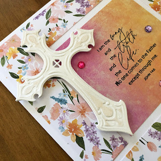
The Way, the Truth, and the Life


Hi everyone and welcome on this Leap Day Thursday!  We're having a sale, so be sure to scroll at least far enough to see what that's all about!    

Usually my projects come together by auditioning various stamps, papers and embellishments along the way but every once in a while I will have a pre-crafting glimpse of an idea.  That's what happened with today's card...I saw the colors and design in my mind's eye one evening and went up to the studio the next morning to put it together.  It's a simple design that lets the scriptures speak for themselves.  


I've been spending a lot of time with these "champagne/ballet/baby"  pinks lately (in my spinning and in my knitting as well as my card-making) so that may be partly why these particular papers and ribbons really spoke to me.  (I'll share photos of the other crafts after the paper-crafting for those who'd like to see).  


The focus of this card is one of our scripture sentiments stamped on a beautiful wash of colors from Craft Consortium's Grunge Light paper pad.  The "frame" is a print from Echo Park's My Favorite Easter.  I've really enjoyed playing with prints from this assortment.   


The cross is die cut from pearlescent white card stock.  I gave it the faintest hint of blush with a pale peachy-pink Copic marker.  


I used a length of narrow silk ribbon to make a fluffy bow and added paper flowers and sparkly beads in colors drawn from the patterned paper.  There are a few rhinestones of various colors sprinkled across the card front as well.  


And here is the inside...more of that beautiful paper with coordinating scriptures and a simple heart-shaped die at the center.  

Supplies:


**************

If you're interested in the other crafts too, keep reading and scrolling!  


Here are the promised photos of my other crafts.  I'm spinning fiber from my friend Rebecca using a Jenkins finch Turkish spindle.  The photo above is the most accurate color representation...for some reason this color really freaks my iPhone out and I have trouble capturing it accurately, especially when it's cloudy outside.


A faded photo but it shows my progress. Still a bit of braid to go. I haven't decided yet what I'll knit with this yarn once it is finished.
 

This is commercial "Emma's Yarn" in the (pinker than it looks here) color way "Himalayan Salt" on two different bases (one fingering wool/silk, the other Suri Alpaca/silk).  Yes, I told you that I love this color!  


This is the "Lenu" sweater that I started in mid-January using the commercial yarns shown above, held together as one.  It is knitting up so soft and squishy!  I am hoping to finish it to Scotland and wear in late April.  Just one sleeve and a few inches of body to go!  The pattern has a separate hoodie with a coordinating stitch pattern so if I have enough time I'll knit that too.


And surprise!  Just to keep things lively, two separate views of a single sock in Mardi Gras colors that I acid-dyed onto Knit Picks Stroll Bare!  This is my qualifier for this year's Sock Madness. I will not likely finish its mate in time because we both got the flu and I just did not feel like doing anything, even knitting. What a shame that when one has all that unoccupied time in the easy chair, there's no energy or focus to do anything constructive with it!


I've finally managed to finish just this one sock so hopefully I can at least qualify for cheerleader, which means being granted access to the rest of this year's Sock Madness patterns.  I'm still knitting but it would take a miracle to finish another sock by the deadline (which is in the wee hours of Friday morning).  Yes, I am a little bummed but hey, Life happens!

Thanks for visiting my blog on this special day!  Hope to see you again soon!  

Thursday, February 22, 2024

Dial-a-doodle-doo!


Hi everyone!  

If you've been around for a while you know that I love to spin, and for a spinner, Spring is the season for shearing and new fleece to wash/process/spin.  So here is a viewfinder "dial a doodle-doo" card featuring some barnyard friends along with a few treasured words of wisdom.


The base of this card is 4.0 x 5.5 inches, but the overhanging banner and the edge of the viewfinder spinner bring the measurement to the full standard 4.25 inches wide.  


I used the largest Spellbinders die to cut one circle from card stock and another from copy paper.  Folding the copy paper circle in half and then in half again helps to find where to punch a tiny hole in its very center.  I also used the template to divide the spinner into quadrants for aligning the individual stamps.


You'll need to be careful to align your spinner so that there is that little bit of overhang, but still room for the other elements and embellishments you wish to include on your card front.  


I figured out the placement of the brad and then decided what pair of circle dies to use for the "peek" part of the viewfinder.  Take care to align the opening so that the edges of the larger circle do not show through from underneath.  I like for the mat layers to show, so I cut the larger circle of the pair where I want it to go on the thin designer paper.  After glueing the designer paper to the underneath layer, the smaller circle is easy to align to cut the opening through the mat layer of card stock.


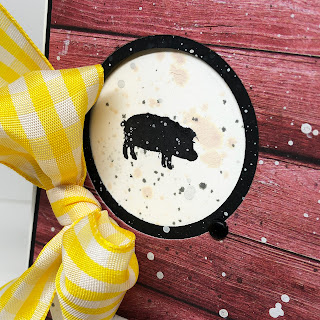
Here is a look at the sentiment and that fun rustic barn designer paper.  And I'll let you in on a secret:  I got a tiny smudge of black ink beside that little piggy so I decide to give everything a generous splattering of tea dye distress ink, black distress oxide ink, and diluted white acrylic paint.  I hope you'll think that it gave everything a fun, grungy barnyard kind of vibe with a side of sunshine.  


A sheet of designer paper from Craft Consortium's Over the Rainbow brings the cheerful yellow of the ribbon from the card front to the inside, a reminder of sunny skies and happy times when the stress of life has made them difficult to call to mind!